The Weather in the Work: Ten Colour Palettes Coming Out of UK Studios in 2026
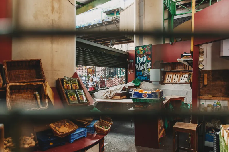
Palettes do not arrive from nowhere. In UK studios this year, they are being pulled from wet brick, coastal lichen, market awnings and the particular grey of a bus shelter at 4pm. I asked painters, designers and makers what combinations they are actually mixing in 2026. The result is not a trend report. It is a weather report. Here are ten palettes emerging from UK studios, with notes on why they work and how to borrow them without simply copying.
1. Rain-darkened brick, wet slate and sodium amber
#6E3B34 / #3F4548 / #D98E32
This is the palette of a northern high street after rain: warm brick, cold slate, and the orange glow of a streetlamp. Saira Khan, a painter in Manchester, says: 'You need one colour that looks like it has been outside.' The amber does the work of a highlight, but it never feels clean. It feels borrowed from a puddle.
2. Coastal lichen, chalk cliff and gull grey
#A8B29A / #E8E1D3 / #8C9494
Eilidh Fraser, a textile artist in Inverness, calls lichen 'the most honest colour in Britain'. It is green without being fresh, yellow without being bright. Against chalk and gull grey it reads as a landscape rather than a scheme. Use it when you want a palette that looks weathered before it is printed.
3. Market-stall pink, tarp blue and bruised aubergine
#F04F8A / #2B5D8C / #4A2C4D
Fluorescent pink is having a moment, but it is not new. It has been on market stalls for decades, next to blue tarpaulin and cheap aubergine crates. Leo Mercer, a printmaker in London, says: 'Fluorescent pink is not a joke if you put it next to tarmac.' The dark aubergine stops the pink from floating away. The blue gives it somewhere to land.
4. Peat brown, heather purple and bog cotton cream
#4B3A2F / #7D5A7A / #E6DCC8
This one comes from upland Britain: dark peat, muted heather, the pale heads of bog cotton. It is a soft palette, but not a sweet one. The brown keeps the purple from turning decorative. The cream is not white; it is the colour of something dried outdoors. It works well in ceramics, textiles and book covers that need to feel grounded.
5. Tea-stain cream, chimney soot and post-office red
#E6D3B3 / #2E2A28 / #B23A2F
Ade Okoro, an architect in Birmingham, says: 'Brick is not red; it is a hundred kinds of brown.' This palette takes that seriously. The cream is aged paper, the soot is almost black, and the red is the specific red of a post-office sign or a Victorian tile. It is formal without being stiff. It looks like a city that has been repainted many times.
6. Sea-glass green, ferry orange and rust
#7FA89A / #E86A33 / #9C5A3C
Ferry orange is a very particular colour: safety equipment, lifeboats, the side of a Caledonian MacBrayne vessel. Put it next to sea-glass green and rust and you get a palette that is coastal without being cute. It is about working boats, not beach huts. The green cools the orange; the rust makes both feel older.
7. Lichen yellow, tarmac grey and safety yellow
#C7C46A / #55575A / #F2C94C
This is a studio palette for people who walk to work. Lichen yellow is the dull, useful yellow of a wall by a car park. Tarmac grey is the ground. Safety yellow is the accent that appears on a bollard or a skip. It is a high-contrast combination, but the grey keeps it from feeling like a warning sign. Use the safety yellow sparingly.
8. Rhubarb pink, custard yellow and moss
#C46A7A / #E9C46A / #6B7F4E
This is a Yorkshire allotment palette: rhubarb, custard, moss. It sounds like a dessert, and it nearly is. The trick is the moss, which stops the pink and yellow from becoming too polite. It is a good combination for illustration, packaging and any project that needs to feel edible without being childish.
9. Slate blue, wet sand and blackberry
#4A6274 / #C2B29F / #3B2A3D
Nia Hughes, a photographer in Cardiff, says: 'The grey is the point.' This palette is built around Welsh weather: slate roofs, wet sand, blackberry hedges. The blue and the sand are quiet; the blackberry adds a dark, juicy note. It is a palette for long exposures, soft shadows and work that does not shout.
10. Fluorescent orange, concrete and navy
#FF6B35 / #B8B4AC / #1F2A44
Glasgow gives you concrete, navy sky and the orange of a temporary barrier. This is a harder palette than the others. The concrete is not a neutral; it is a texture. The navy gives the orange a frame. It works in graphics, signage and interiors that need a bit of civic grit. It is not cosy. It is not meant to be.
Building a palette that feels rooted
The lesson from these ten combinations is not to copy the hex codes. It is to copy the method. Build a palette from place, not from a trend deck. Collect physical samples: a brick chip, a leaf, a receipt, a photo printed badly. Name each colour after where you found it. Test the combination under British light: a north-facing window, an overcast afternoon, a sodium streetlamp. Limit yourself to three or four colours and one accent. If a combination only works on screen, it is not rooted. If it works on a wet Tuesday, it is yours.